Mono 2-Deg Poly Fit + Doubling (d1)
You are currently viewing a graph of old data. To see the most current graph, please visit:
Disclaimer: This page shows a hypothetical model attempting to predict the future spread of coronavirus. It was automatically generated using an open-source algorithm. Such a model is inexact and may be wildly inaccurate. See below for more details.
For a list of other Extrapolation Models against the COVID-19 data, see our Models Page
 share
share tweet
tweet| # Cases | Date | Days since previous doubling |
|---|---|---|
| 1000 | 2020-04-02 | - |
| 2000 | 2020-04-06 | 4 |
| 4000 | 2020-04-12 | 6 |
| 8000 | 2020-04-22 | 10 |
| 16000 | 2020-05-07 | 15 |
| 32000 | 2020-05-28 | 21 |
| 64000 | 2020-08-15 | 79 |
| 128000 | 2020-10-28 | 74 |
| 256000 | 2021-01-18 | 82 |
| 512000 | 2021-04-26 | 98 |
| 1.024 million | 2022-07-29 - 2022-08-09 |
459 - 470 |
About This Model
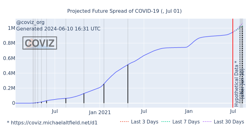
The chart above attempts to predict the future number of COVID-19 cases for the given region. The Y-axis shows the number of people who have tested positive and the X-axis is time. The vertical red line (labeled "Hypothetical Data") is the present day (on our latest graph). Everything to the right of the red line is the future, and its lines are calculated from the extrapolation model.
In this model, there's three distinct predictions:
- Last 30 days The purple line does a second-degree polynomial curve fit against the most-recent 30-days of data in the dataset
- Last 7 days The green line does a curve fit on the most-recent 7 days of data
- Last 3 days The red line does a curve fit on the most-recent 3 days' data
You'll find that, depending on recent events in the past 3-days, the red line will flap around more wildly day-to-day than the others. This can be a useful coorelation indicator for the consequences of recent events, such as prematurely ending lockdowns.
The "d1" model shown here builds on the e2b model, which does a simple monotonic second-degree polynomial curve fit using numpy's poly1d() function.
Unlike e2b, this model tracks the "doubling" time, which is the amount of time it takes for the number of COVID-19 cases in the given region to multiply by two. Doubling tracking begins at 1,000 cases. Therefore, the second doubling is 2,000. Then 4,000, 8,000, 16,000, etc
At every doubling, a black tick is drawn on the graph indicating the height of the doubling in terms of number of cases. A vertical transparent "band" is also drawn behind each of these ticks. The distance between these bands over time gives a visual to the amount of time it takes for COVID-19 cases to double over time.
To the right of the red "hypothetical data" line, predictions for the next date of doubling are marked with a dashed vertical black line originating from the x-axis and terminating at its cooresponding trace
Below the chart is a data table that lists every doubling that occured in the historical dataset for the given region, starting with 1,000 cases. The last row in this table is a projection using the curve fitting algorithm to predict when the next doubling will occur in the future.
This model is an improvement over Coviz's first model (e2a), yet it's still very simple and has many shortcomings.
- Model Short Name: d1
- Model Full Name: Mono 2-Deg Poly Fit + Doubling
- Submitted By: Michael Altfield
Pros
- Easy to write in python
- Easy to comprehend how it works
Cons
- Expects exponential growth
- Doesn't take into account herd immunity
- Doesn't take into account history of previous pandemics
- Assumes y is infinite, yet there's a finite max human population
- The monotonic implementation causes some nearly-negligable precision to be lost in the polynomial curve fit plot
If you'd like to submit your own Extrapolation Model that fixes some of the issues above, see our guide to developing and submitting models.
Country-Specific Charts
You can view graphs generated from data specific to individual countries below:
Previous Graphs
You can view graphs generated from data on previous days below: